Katie Clarey* says that with workplace culture becoming more relaxed and office design more vibrant, now is the time for HR to consider colour.
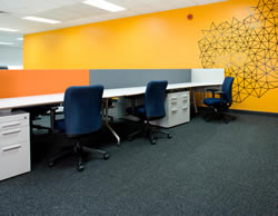
Photo: Shutter Worx
The fire-red paint swept across one wall of a conference room plays a surprisingly important role in workplace culture and employee engagement.
So does the sunshine-yellow couch inviting guests into a lobby.
Colour defines a workplace’s setting and can manipulate workers’ moods, according to Nicole Andreu, Senior Vice President and Design Director of Commercial Interiors at CannonDesign.
“Red has energy and passion. Yellow is for happiness. Green is for growth and stability,” she said.
This can all be explained by something called colour theory, which, among other things, allows designers to understand the context of how colour is used, Andreu said.
With workplaces becoming more vibrant, at least in design terms, HR professionals may want to consider how colour choices might affect workers, Associate Director of Drexel University’s Interior Design Program, Ada M. Tremonte said.
“We’re beginning to talk more about people and human performance and behaviour, and how you can actually change someone’s behaviour by their environment, which is why HR is getting involved in a lot of this,” she said.
What is colour theory?
There is no tidy definition of colour theory — it can mean a lot of things, Andreu said.
“Colour affects our mood,” she said.
“It can create balance or imbalance depending on how it’s used.”
Tremonte’s explanation echoed Andreu’s.
“Colour has the ability to change how people feel,” she said.
“It can calm people, it can bring people together, it can make people excited.”
Whichever colour is chosen, it produces an effect; that’s what colour theory posits.
Need energy? Paint the office red
Colour theory helps explain how colour works as an element of design, but it also goes further to help designers and artists predict how a colour — even a particular shade of a colour — might impact the viewer.
Imagine the entrance to an office, for example.
Now picture that area set off by walls coated in a deep eggplant.
“We use dark colours to create some mystery when you’re walking into a space,” said Lauren Dennison, Design Director at Vocon.
“We use brighter or more intense colours to create moments that leave a lasting impression on people who are walking through the space or experiencing the space first hand.”
Primary colours can generate a lot of energy in a space, Andreu said, specifically noting that red is not the only colour to elicit such a feeling.
Primary colours are versatile, too — “you can use them in so many different ways,” she said.
“I’ve been seeing a lot of trends that are a direct reaction to the very corporate white, sterile-looking office spaces of the past 15 to 20 years,” said Dennison.
“They’re looking for something a lot warmer, more like a living room feel.”
Picking a palette
The power of colour is so strong that those deciding on colour for a workspace must use extreme care in putting together a palette to ensure it supports the organisation’s mission and culture.
Colour at work: branding and wayfinding
Colour takes on particular usefulness for employers looking to make the workplace comfortable for employees who prefer an informal environment, Andreu said.
“Employers are trying to attract young talent who feel the workplace is an extension of their home,” she said.
“Colour is becoming more used.”
Colour can help with wayfinding in a workplace as well, Tremonte said.
Employers can use colour to differentiate spaces from each other.
“People are encouraged to work anywhere they want in the office, and there’s different qualities of places to work from very focus-oriented where you really have to have quiet and heads down and working alone to where you’re really working with other people,” she said.
Quick tips
Choose neutral colours first:
“You can make a big statement by picking the perfect white or neutral,” Dennison said.
Then add colour where people are going to notice it.
“When you have a mass of people’s work stations, you want that to disappear,” she said.
This is not the place to add a magenta tapestry threaded with gold.
Save that for the reception area and paint the work area white.
Work with key decision-makers to pick colours:
“Personally, I would pick a few colours that represent a feeling that your leadership would want to convey, and then I complement those colours with other materials like wood, stone or metal,” Andreu said.
“Complementing colours with other materials is important.”
Go for it:
“Don’t be scared to take a risk and try something bolder if your goal is to make a statement,” Dennison said.
“You can always repaint.”
* Katie Clarey is an Associate Editor at HR Dive. She tweets at @kclarey21.
This article first appeared at www.hrdive.com.